Visualize DAG with Graphviz
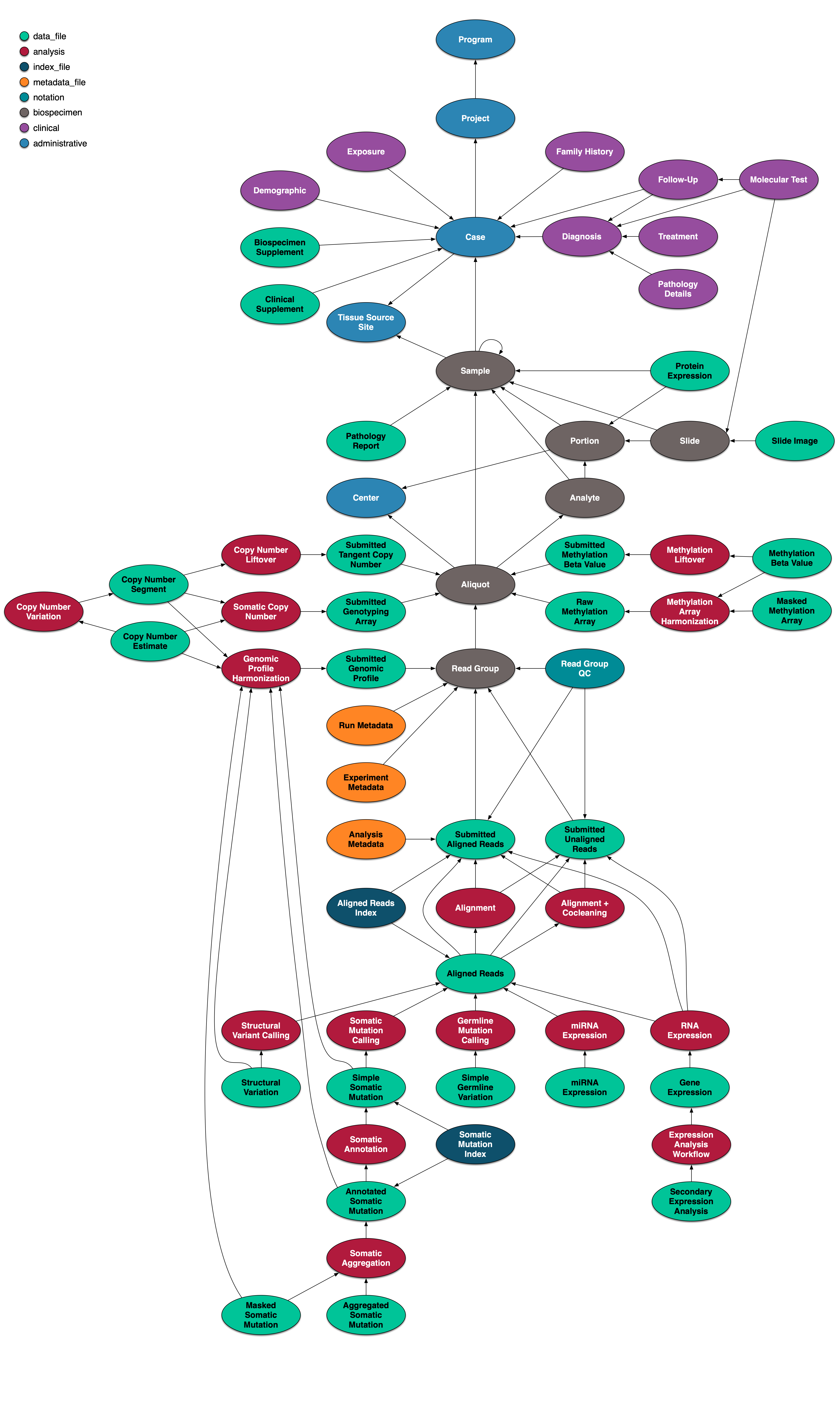
25 Mar 2023At GDC, we have a graph saved in database. The structure of the graph is defined with GDCDictioanry. To write tests for our softwares, we need to create and load fake data in our test database. The fake data is usually in yaml format. With complicated test cases, we will need many nodes and edges in the test data. It will be hard to create or modify those fake data.

---
nodes:
  - label: case
    node_id: ee327e98-a722-4609-a9ff-e1da88169b3e
    submitter_id: case_1
  - label: sample
    submitter_id: sample_1
    tissue_type: Normal
    sample_type: Blood Derived Normal
  - label: portion
    submitter_id: portion_1
  - label: analyte
    submitter_id: analyte_1
  - label: aliquot
    node_id: 1f8557c3-33a3-4fca-b7d1-2464f14c9514
    submitter_id: aliquot_1
    no_matched_normal_wxs: false
    no_matched_normal_targeted_sequencing: false
    selected_normal_wxs: true
    analyte_type: DNA
    selected_normal_targeted_sequencing: false
  - label: read_group
    node_id: dfbdabb5-5d9e-442a-a9ac-eea5132324ed
    submitter_id: rg_1
    single_cell_library: Chromium 3' Gene Expression v3 Library
    target_capture_kit: SureSelect Human All Exon v5
  - label: read_group
    node_id: 2c560954-d0d0-4d35-9c44-24e483059697
    submitter_id: rg_2
    single_cell_library: Chromium 3' Gene Expression v3 Library
  - label: submitted_unaligned_reads
    node_id: 57261c6c-918d-4b71-b96c-80db0024fa7a
    submitter_id: sur_1
    experimental_strategy: m6A MeRIP-Seq
edges:
  - src: sample_1
    dst: case_1
    label: cases
  - src: portion_1
    dst: sample_1
    label: samples
  - src: analyte_1
    dst: portion_1
    label: portions
  - src: aliquot_1
    dst: analyte_1
    label: analytes
  - src: rg_1
    dst: aliquot_1
    label: aliquots
  - src: rg_2
    dst: aliquot_1
    label: aliquots
  - src: sur_1
    dst: rg_1
    label: read_groups
To help us with large test data, we should visualize the test data. It is much easier to understand the relationships with charts than reading a yaml file. Graphviz is an opensource graph visualization software. Dot language is used by graphviz to create the graph. As we are mostly using python for our develop, we use the python version of graphviz to generate our chart.
To visualize our test data, I wrote a the following script using graphviz to create a chart. And my colleague Rowland add color to the graph so different node types will have different colors.
import json
import os
import uuid
from functools import lru_cache
from typing import Dict, List

import requests
import yaml
from graphviz import Digraph

def draw(nodes: List[Dict[str, str]], edges: List[Dict[str, str]], reverse=False):
    dot = Digraph('g', filename='btree.gv',
        node_attr={'shape': 'record'})

    node_id_to_submitter_id = {}
    for node in nodes:
        submitter_id = node.get("submitter_id")
        node_id = node.get("node_id")
        suffix = f":{node['gencode_version']}" if node.get("gencode_version") else ''

        if submitter_id and node_id:
            node_id_to_submitter_id[node_id] = submitter_id + suffix
        elif submitter_id:
            node_id_to_submitter_id[submitter_id] = submitter_id + suffix
        else:
            node_id_to_submitter_id[node_id] = node_id + suffix

    print(node_id_to_submitter_id)

    for node in nodes:
        n_id = node_id_to_submitter_id.get(node.get("node_id") or node.get("submitter_id"))
        # print(n_id, node.get("submitter_id"), node.get("node_id"))
        dot.node(n_id, fillcolor=get_color(node["label"]), style="filled")

    for edge in edges:
        src = node_id_to_submitter_id.get(edge["src"]) or edge["src"]
        dst = node_id_to_submitter_id.get(edge["dst"]) or edge["dst"]
        # print(src, dst, edge['src'], edge['dst'])
        if reverse:
            dot.edge(dst, src)
        else:
            dot.edge(src, dst)

    return dot


def draw_yaml(yaml_raw):
    try:
        yaml_dict = yaml.load(yaml_raw)
    except yaml.scanner.ScannerError:
        yaml_dict = json.loads(yaml_raw)

    return draw(yaml_dict['nodes'], yaml_dict['edges'])


def draw_url(url):
    response = requests.get(url)
    print(response.status_code)
    return draw_yaml(response.content)


@lru_cache(maxsize=256)
def get_color(label: str) -> str:
    label = str(uuid.uuid5(UUID_NAMESPACE, label))
    label_color = hex(int("".join(map(str, map(ord, label)))) & 0x00FFFFFF)
    return "#{:f<6}".format(label_color[2:])


UUID_NAMESPACE_SEED = os.getenv("UUID_NAMESPACE_SEED", "f0d2633b-cd8b-45ca-ae86-1d5c759ba0d1")
UUID_NAMESPACE = uuid.UUID("urn:uuid:{}".format(UUID_NAMESPACE_SEED), version=4)
It simply use dot.node(node_id) to add a node to the chart and dot.edge(src_node_id, dest_node_id) to add an edge to the chart.
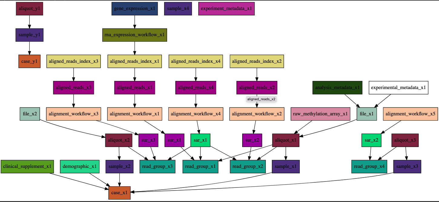
Now the data above will be converted to the following chart:

This is much easier for developers to analyze the data and understanding the relationships between the nodes and edges in the data.
If the above example is not strong enough. Here is another picture. With so many nodes, it will be almost impracticle to understand and remember all the relationships by only reading the yaml file.

This tool has made our developer work much more joyful.