Visualize 2D NMR spectrum with Python
06 Apr 2023To better understand the NMR files, we can use Python’s Matplotlib to visualize the NMR files and compare the results with the NMR software.
Visualize NMR csv files
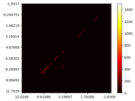
From MestReNova, we can export a 2D NMR spectrum with NMR csv format. The first row and first column of this csv file is the PPM. The rest data are heights of the spectrum at different locations.
The code to visualize the csv file is straight forward:
import matplotlib.pyplot as plt
import pandas
cosy2 = pandas.read_csv('/path/to/cosy2.csv', sep="\t", header=0, index_col=0)
cosy2 = cosy2[cosy2.columns[::-1]]    #  reverse columns to match the NMR software

# use ppm for labels
xticks = (0, 500, 1000, 1500, 2000)
xlabels = tuple(cosy2.index[i] for i in xticks[::-1])
yticks = (0, 250, 500, 750, 1000, 1250, 1500, 1750, 2000)
ylabels = tuple(cosy2.columns[i] for i in yticks[::-1])

plt.xticks(xticks, xlabels)
plt.yticks(yticks, ylabels)
plt.imshow(cosy2, cmap='hot')
plt.colorbar()
The above code will generate a picture like this:

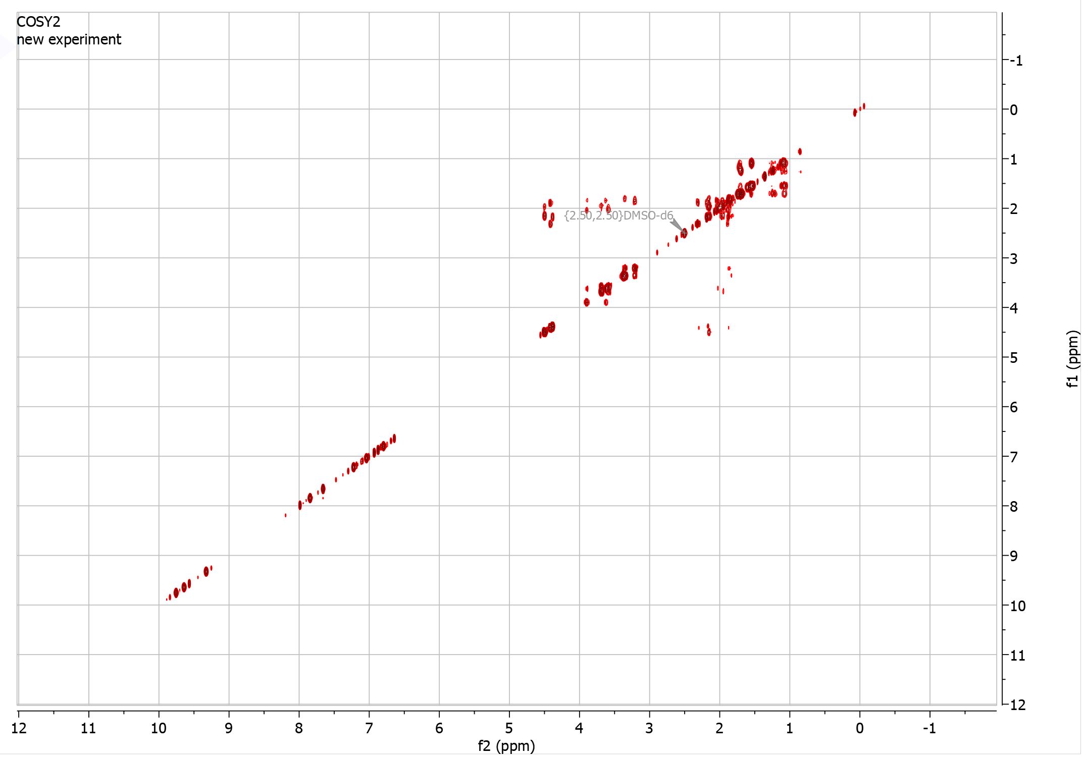
Which is similar to the original data shown in MestReNova:
Visualize ucsf data
The ucsf data is a binary format, we need to load the data first:
dtype = np.dtype('B')

with open('/content/drive/MyDrive/documents/dr cai/compound_1/processed data/ucsf/usf_bh-20230328_c13hsqc.ucsf', 'rb') as fp:
  hsqc_byte = np.fromfile(fp, dtype)
  print(chr(hsqc_byte[0]))
  for i in range(180, 183):
    print(chr(hsqc_byte[i]))

  hsqc_array = hsqc_byte[436:]  # Skip headers

floats_array = np.fromstring(hsqc_array, dtype='>f4')     # convert bytes to 32 bit float

float_array_3d = np.reshape(floats_array, (64, 128, 128)) # reshape into 8 * 8 tiles

# horizontal stack each row of tiles
l = []
for i in range(8):
  for row in np.hstack(float_array_3d[i * 8: (i+1) * 8]):
    l.append(row)
floats_array_2d = np.array(l)

floats_array_2d = floats_array_2d[::-1]         # reverse rows

# visualize numpy matrix
plt.figure(figsize=(10,10))
plt.imshow(floats_array_2d, cmap='seismic', vmin=-1e8, vmax=1e8)
plt.colorbar()
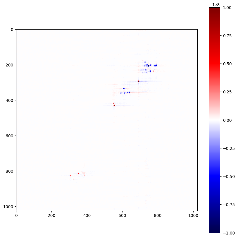
The above code will generate the picture below:

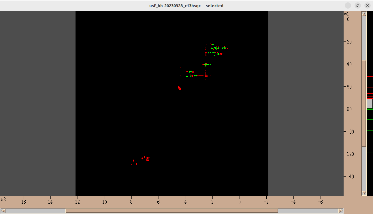
Which is similar to the original data shown in sparky:

